
Work / So Sushi
So Sushi
A fast-casual sushi concept that needed a brand capable of holding its own in a busy campus environment.
Client
University of Toronto Food Services
Services
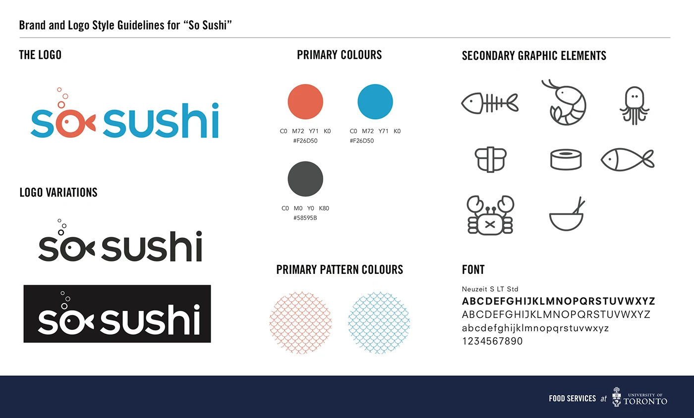
Brand Identity, Print Design, Brand Guidelines
Deliverables
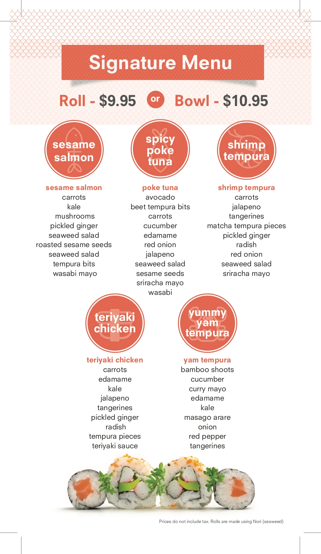
Logo & mark system, icon set, menu design, in-store graphics, brand guidelines
The brief
Approachable enough for everyday. Distinctive enough to stand out.
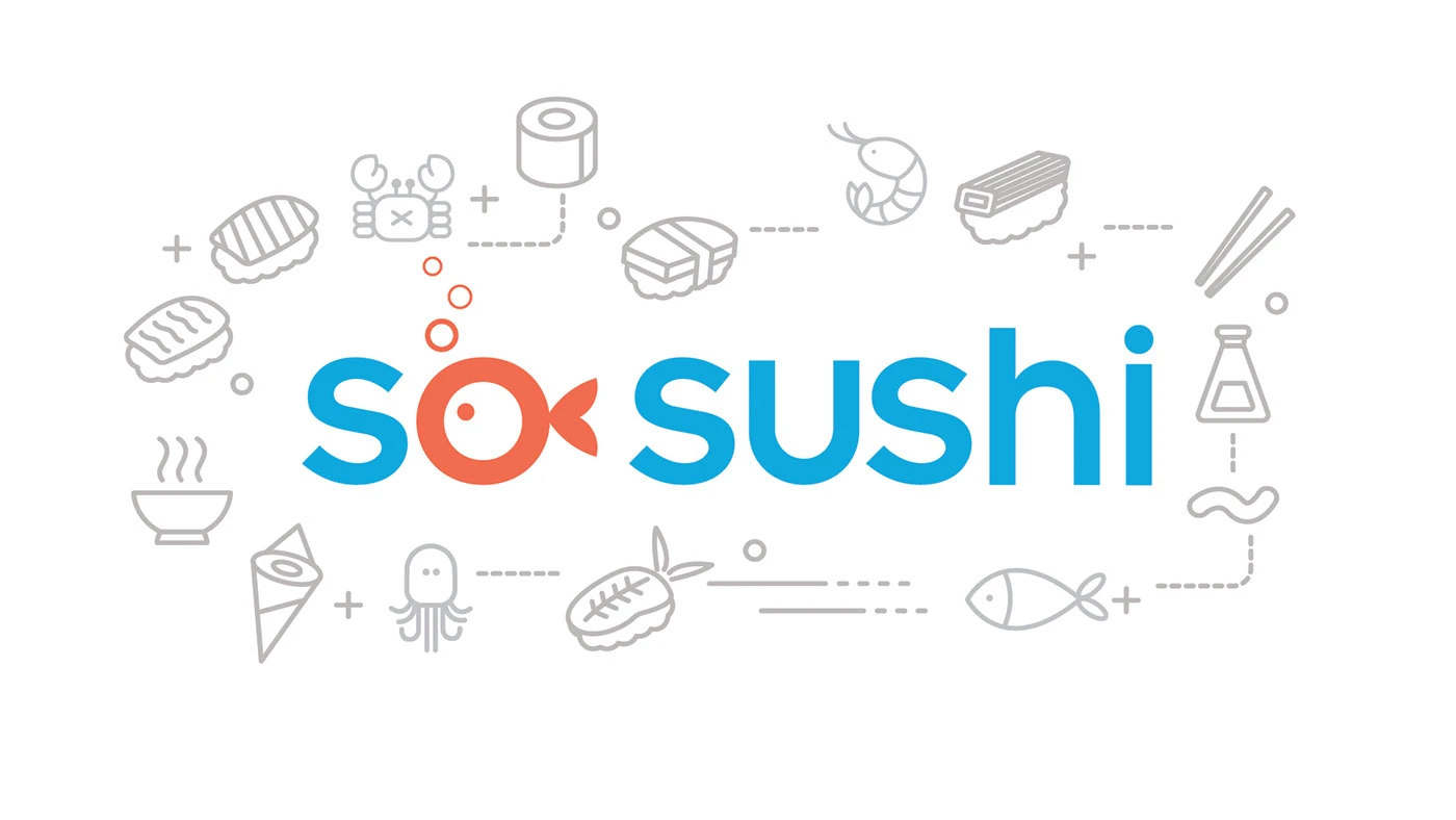
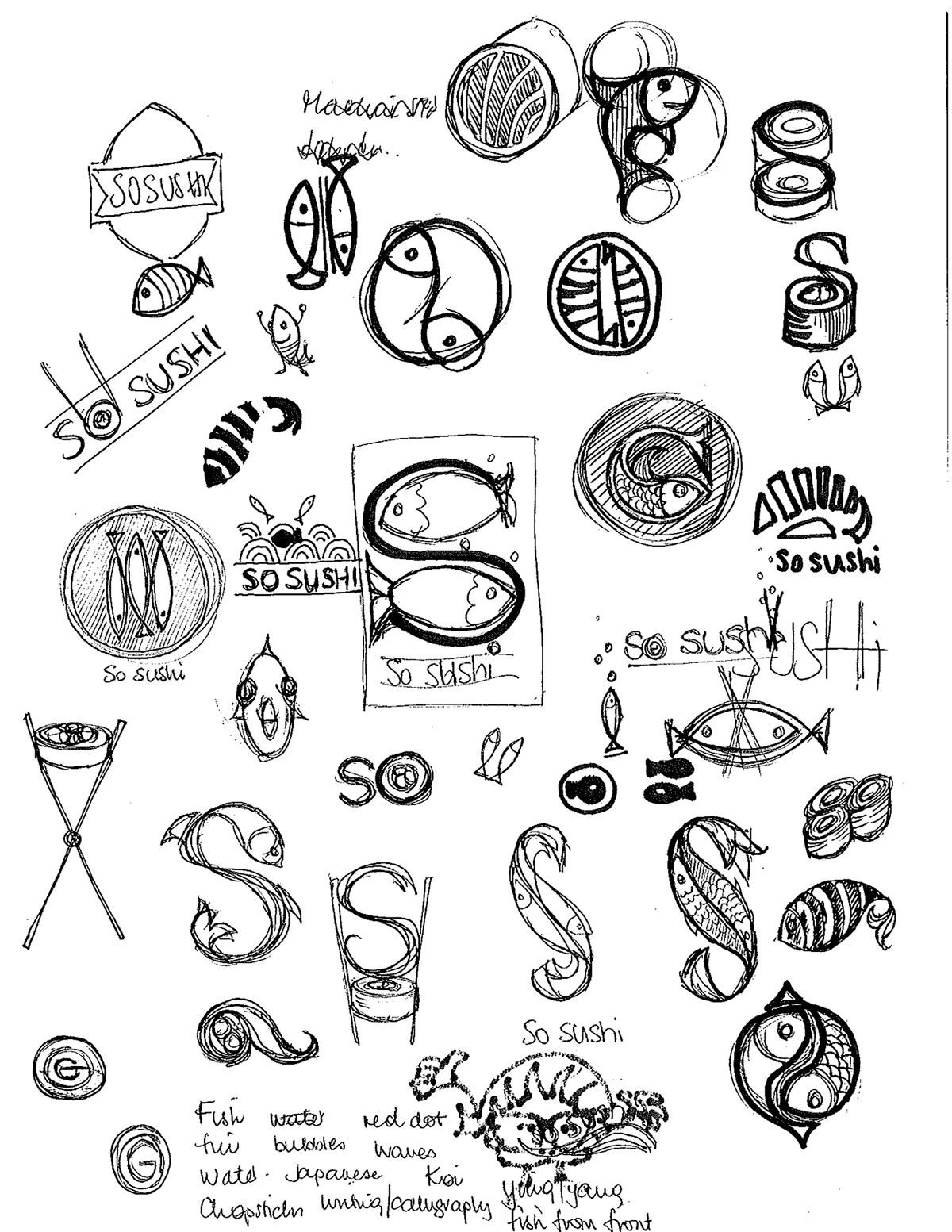
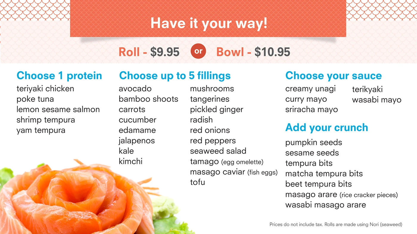
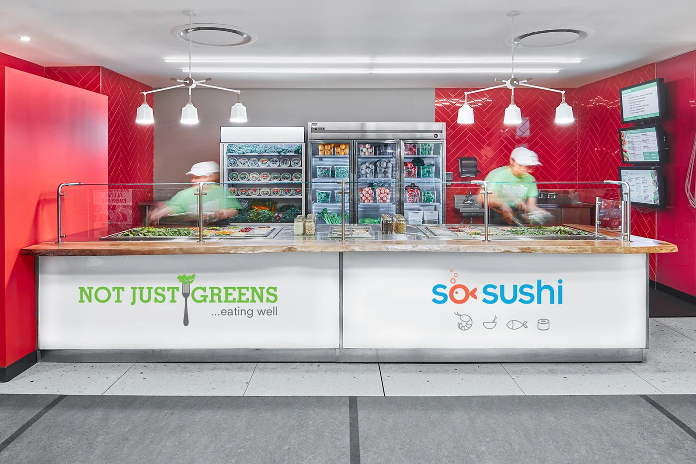
A fast-casual sushi concept operating within the University of Toronto’s food services program needed a brand that could hold its own in a busy campus environment — approachable enough for everyday use, distinctive enough to stand apart from everything around it. The solution was a clean, energetic identity built around a custom logo mark — the “o” in So doubling as a fish, with bubbles rising from it. Bright coral and sky blue kept the brand feeling fresh and food-forward. A full suite of brand assets followed: menu design, in-store graphics, brand guidelines, and an icon set that brought personality to every touchpoint.
You’ve been thinking about this long enough.
Every project starts with a conversation. No charge, no obligation.
Now taking on new projects for summer 2026.